Row with Grid is very basic building stone of every page layout based on our TemplateEngine layout plugin for Pimcore. Thanks to Grid widget user can quickly build complex layout structure fully customizable for multiple responsive device screen sizes.
¶ Grid Basics
Every Grid is based on multiple content columns displayed in one row. Most common grids are based on 12 columns. Each content column in Grid can be configured to occupy 1 to 12 grid columns. For example if you want to have three same width columns per page width than you configure each content column to occupy 4 grid columns (12 / 3 = 4). Our grid system is based on Foundation CSS library which is mobile-first. Content column sizes for small screens are inherited by larger screen sizes. Start with small screens and customize larger screens sizes as necessary.
¶ Default Responsive break points:
- small: 1-640px
- medium: 641-1024px
- large: 1025-1440px
- x-large: 1441-1920px
- xx-large: >1921px
please note: Break points are customized per site and usually are slightly different from default values, based on the site design! Please ask your developer or look into your site specific documentation (if provided) for more information. X-Large & XX-Large sizes are not enabled by default, please check with your developer .
¶ Grid Widget
When you add Grid widget into page you will see something similar to following image:

¶ Grid Editor UI
To open Grid Editor GUI click on widget navigation bar handler

then click on Grid Editor icon to show "Grid Editor GUI" (same button can hide it)
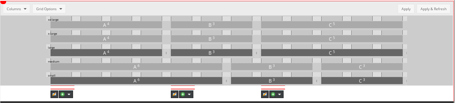
On following image we can see Grid Editor GUI - column management which allows easy and fast Grid configuration with a few clicks of your mouse.
Editor shows the grid system with 12 columns and gutters (spaces between columns). It also shows five responsive size breaks (small, medium, large, x-large, xx-large *) representing mobiles, tablets, normal computer displays, and larger displays . You can specify content column size for each responsive screen size. Sizes are defined by how many grid columns any content column occupies. As you can see bellow, content column are displayed using two shades of grey colour. Darker grey represents content column with specified size, lighter grey shows columns which inherits its size from smaller responsive size break. Small numbers next to column name show haw many grid columns this content column occupies.
* X-Large & XX-Large sizes are not enabled by default, please check with your developer .
¶ Grid Properties bar

¶ Grid properties bar provides few basic options to configure the Grid widget
- Columns (drop down menu with list of columns to display in widget) (please note: Adding or removing column is applied immediately. Any not yet applied changes made in any Grid Editor will be lost. Please make sure you apply changes before adding or removing columns.)
- Grid Options
- Full Width
- Collapse columns
- Make columns height equal
- Apply (applies changes to grid without refreshing the page so user can continue customizing another widget or make other changes)
- Apply & Refresh (applies changes to grid with refreshing the page)
please note: User must click on Apply or Apply & Refresh button to preserve any customization made in Grid Editor GUI. Clicking on page's Save, Save & Publish or Reload button without firstly applying changes in Grid Editor will result in loosing those changes!
¶ Content column sizes
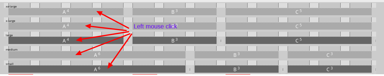
Size of Content column can be changed using two methods: one is simply dragging by small vertical handlers on content column sides (only dark grey columns can be changed using mouse). The second method is available through Column properties dialog which can be opened by left mouse click anywhere on column "A" and opens Colum "A" Properties window
¶ Content Column Properties dialog
Column properties dialog can be used for changing column size, adding CSS classes to column element and much more in future releases of Template Engine, please check this page for updates

to be continued...